


 Filter
 Top Products
11
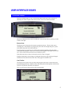
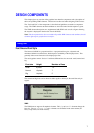
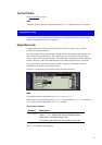
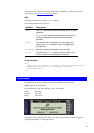
The Card Title Bar
See Card Title Bar on page 5.
WML
The title in the Card Title bar is defined by using the
title attribute in the card element.
Using Select Lists
A select list is an input component that specifies a list of options for the user to choose from.
Single and multiple choice lists are supported.
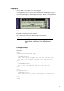
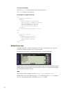
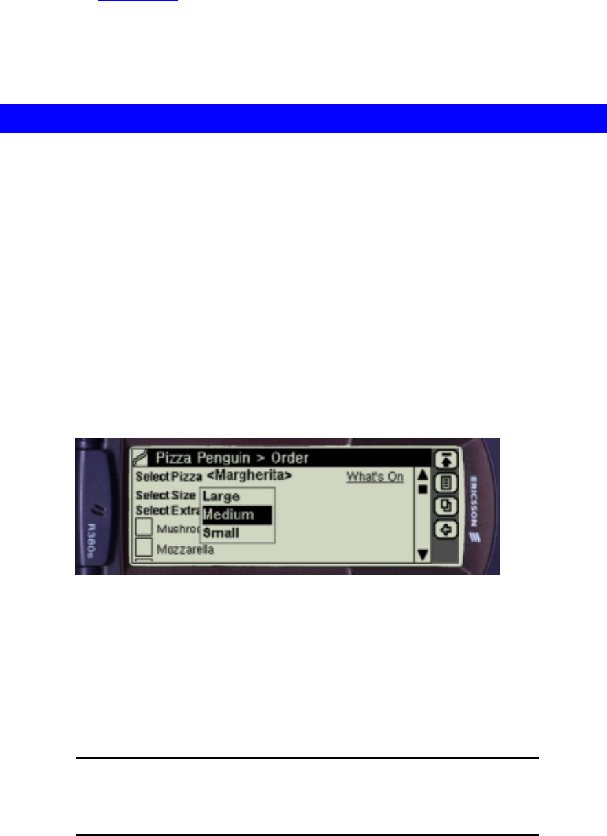
Single Choice Lists
A single choice list is used for the selection of one and only one item in a list. The list is
presented as a drop-down listbox.
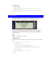
In its closed state the listbox displays the currently selected value within angled brackets (see
Select Pizza in the example below). The component is 15 pixels high and surrounded by 5
pixels of white space to the left and right. The width adapts to the length of the text within the
brackets. However, if the total width should have exceeded 150 pixels the text is truncated.
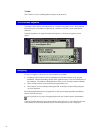
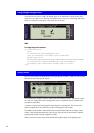
In its opened state, a list with an optional scrollbar is displayed. The number of lines is
unlimited (see Select Size in the example below).
The text in a single choice list is displayed using the Normal bold font.
WML
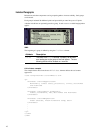
Two elements define a single choice list:
select and option.
Single choice lists are specified using the
select element with the multiple attribute set
to No. Each list item is specified by an
option element.
The
select element
Attribute Description
multiple
The multiple attribute can take the following values:
Yes and No. The default value is No.
To create a single choice list, this attribute is set to No.
The title attribute is not supported.