


 Filter
 Top Products
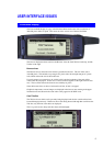
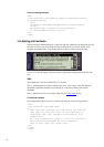
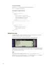
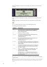

12
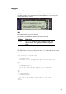
The
option element
Text in the
option element content is used in the drop-down list.
The
title attribute is not supported.
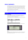
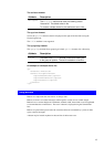
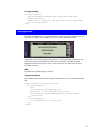
An example of a single choice list
<p>
<b>Select Pizza</b>
<select>
<option>Cappriciosa</option>
<option>Quatro Staggioni</option>
<option>Margherita</option>
<option>Campagnola</option>
<option>Siciliana</option>
</select>
<a href="#pizzainfo">What's On</a>
</p>
<p>
<b>Select Size</b>
<select>
<option>Large</option>
<option>Medium</option>
<option>Small</option>
</select>
</p>
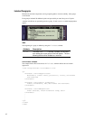
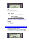
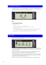
Multiple Choice Lists
A multiple choice list is used for the selection of zero, one or more items in a list. The list is
presented as a number of check boxes, one for each choice.
Each check box is located on a new line and followed by 2 pixels of white space.
Multiple choice lists may be organized into hierarchical groups. Each new hierarchical group is
indented 20 pixels and preceded by an extra line space of 3 pixels. A header in Normal regular
font can, optionally, precede a group.
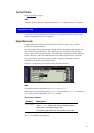
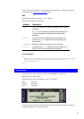
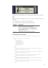
WML
Three elements define a multiple choice list:
select, option and optgroup.
Multiple choice lists are specified using the
select element with the multiple attribute
set to Yes. Each check box item is specified by an
option element.