


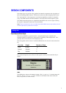
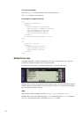
 Filter
 Top Products
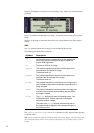

13
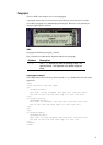
The
select element
Attribute Description
multiple
The multiple attribute can take the following values:
Yes and No. The default value is No.
To create a multiple choice list, this attribute is set to Yes.
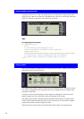
The option element
Text in the
option element content is displayed to the right of the check box using the
Normal regular font.
The
title attribute is not supported.
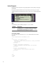
The
optgroup element
The
optgroup element allows grouping of related option elements into a hierarchy.
Attribute Description
title
The value of the title attribute is used as a leading text
to the group of options. The text is located on a new line.
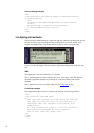
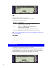
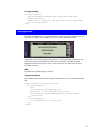
An example of a multiple choice list
<p>
<b>Select Extras</b>
<select multiple="true">
<option>Mushrooms</option>
<option>Mozzarella</option>
<option>Garlic</option>
</select>
</p>
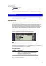
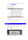
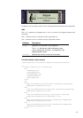
Using Buttons
Buttons are components that start actions or change states.
Buttons are shown as rounded rectangles and designed to contain text of variable length.
Buttons have a constant height and a minimum, standard width, from which it can be lengthened
to accommodate the contained text. The text in a button is displayed using the Normal Bold
font.
Buttons are placed three pixels below the current baseline and surrounded by 5 pixels of white
space to the left and right.
A button may be located anywhere in the text flow of the browser area.